I was commissioned during the 2015 Christmas season to do a portrait of someone’s former dance troupe leader and his partner. After sending me photos of the couple, one of the first things I said was, “Damn, those dudes are dapper!”
So, I knew right away the piece had to look stylish.
But I didn’t want it to look too slick, like some other portraits I’ve done. I wanted something loose, a little “artsy” (whatever that is), and urban without looking noir-ish.
I referenced a few of the photos (which I won’t post here, because they’re not mine) to combine different aspects of each person I wanted to include. Drawing likenesses can be really difficult, whether you’re going for realistic or a cartoon style: realistic is difficult because people will always looks for complete accuracy, and cartooning is difficult because the simplification of the subject needs to have features that are unmistakably recognizable amid the “inaccuracy” of the drawing.
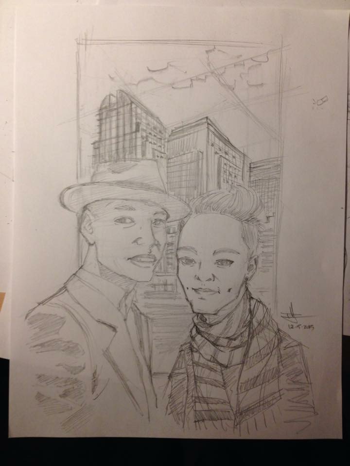
I started out by sketching the position of each subject, and I knew I wanted a frame with dark buildings in the back. After I had everything placed where I wanted and the basic gestures of each figure, I focused on getting the head shapes, eyes, and noses correct, then the mouth. I remembered something artist Cully Hamner had said during an interview with artist Shawn Crystal on Crystal’s podcast, Inkpulp Audio, that they key to caricature isn’t the eyes like everyone thinks, but in the nose, mouth, and shape of the head. Even though I wasn’t doing caricature, I kept this in mind in order to get myself to pay extra special attention to those elements so that I could ensure a closer likeness.
These are the resulting pencils:
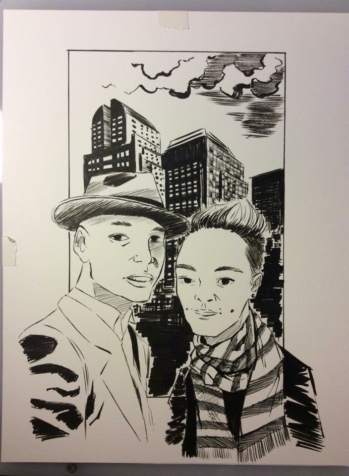
There are a couple things I wish I had corrected or done differently (no, I’m not going to point out my mistakes), but overall I’m pretty happy with this.
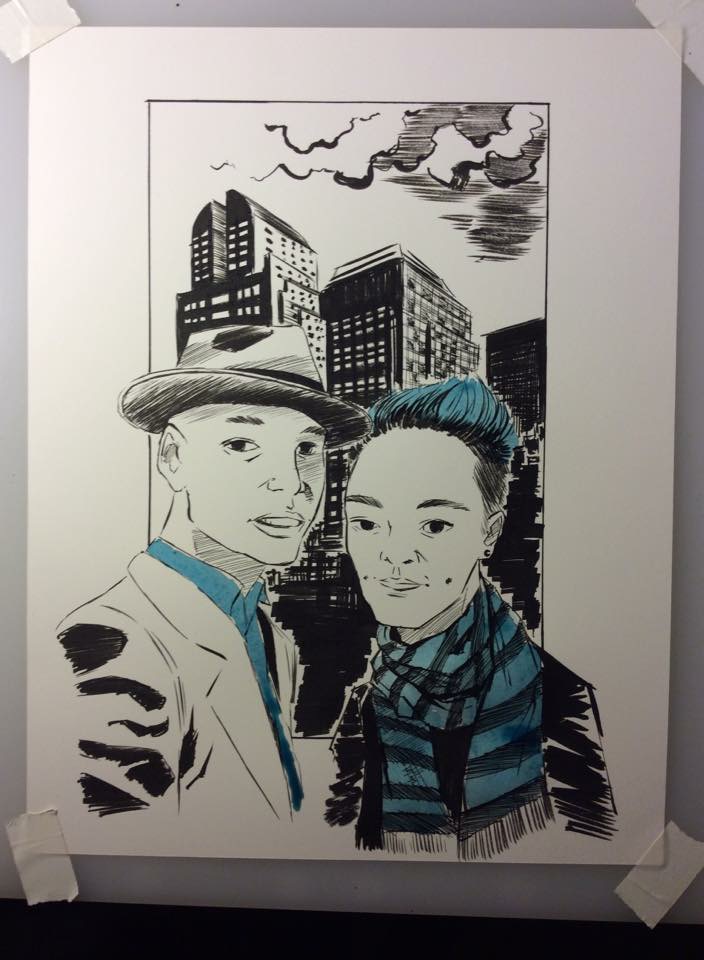
The drawing was framed by one of the client’s friends and delivered to the guy in the scarf. I was sent a video of the opening and he was pretty touched. He liked it so much, in fact, that he commissioned me to do an illustration of his grandparents to give to his grandmother.
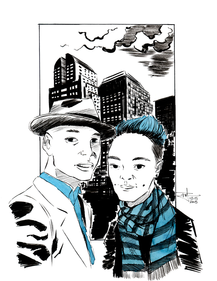
Here’s the final, scanned and “cleaned”: