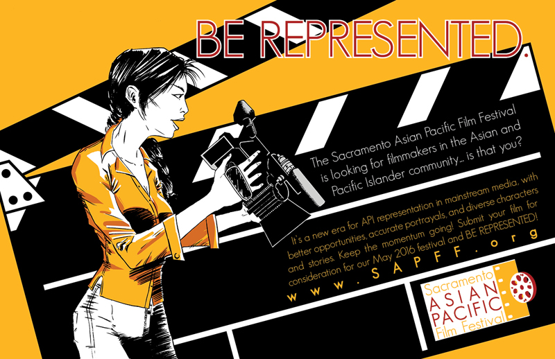
I recently needed to put together a double-page spread advertisement for a local film festival I volunteer for, the Sacramento Asian Pacific Film Festival.
Since I was doing this for a group, and other people needed to approve the design, I did thumbnails. For myself, I only do thumbnails when I need to solve problems. Usually I know what I want. This time, I needed everyone who had a say in the final messaging to approve the concept.
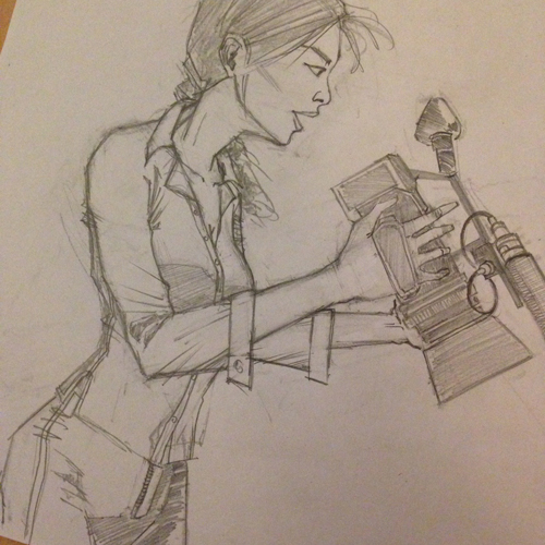
I started with these four sketches, all of them 2″x3″:
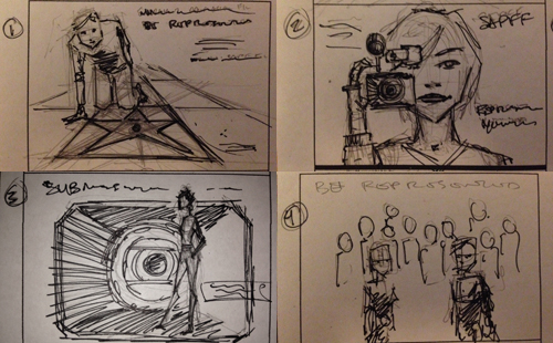
 With the theme for the festival being “Representation”, meaning that we were going to be focusing on Asians and Pacific Islanders in filmmaking, I wanted to make sure an Asian person was prominently featured. Thumbnails 2 and 3 were the favorites. They liked the close-up of the woman in 2 but wanted to pull back more to see more of the figure but still have the camera up, and they liked the background in 3.
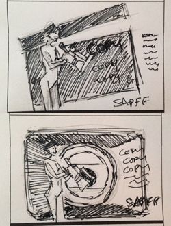
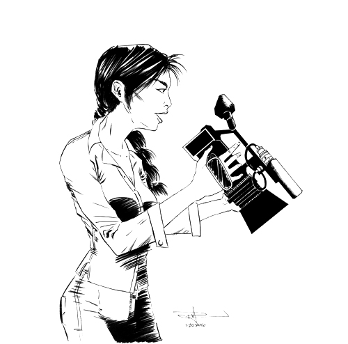
As a result of the feedback I received, I did these sketches. I zoomed out on the woman in version 2 (or zoomed in a bit on version 3’s figure). I switched her to the left side of the page because this was going to be a double-page spread, and since we read left to right, and theoretically the last thing people will see is the messaging content, I wanted the copy to be on the right. While one of the members wanted the camera up to her eye, I brought it down to make sure we could see her face (as cameras are generally on the right hand side, and that was now the side that was facing the reader). I did a rendition not only with the camera lens hood in the background but also with a film marker because I thought the marker would be better for text.
Next, I got to work on the illustration part. I focused on the figure, the face, and the accuracy of the camera.
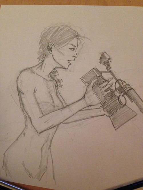
Next, I added clothes. Like many illustrators, I save clothing for last in order to ensure my figure is good. Also, I had no idea what she would be wearing.
I inked everything with a brush because I wanted a clean, slick, “commercial” look. I inked the camera with Micron pens and a ruler. Normally, I like to freehand my lines and use a dip pen, but I knew the background would be done in Adobe Illustrator, so the linework for the mechanical element – the camera – needed to be precise in order to pair well with the vector drawing that would come later. This is a cleaned up version, which I did in Photoshop. I bitmapped the image in order to get rid of any stray greys, making it super clean and ready to pair with a vector drawing.
Now for the colors. To get that commercial look I had in my head, I digitally colored the figure. I set the linework layer to multiply, which essentially makes the white in the linework layer transparent while retaining the black linework. I added my coloring layers underneath. I only wanted to color the shirt, and I knew I’d be adding background elements, so I added a flat color layer of white (as opposed to skin color) for the figure and grey for the camera. This way, no background elements would show through the figure. I used the organization’s logo colors (a specific hue of yellow and red) for coloring. The shirt is, obviously, yellow.

For the shadows, I used the red color in the logo and lowered the opacity to let some of the yellow in, thus blending it.
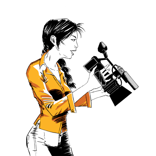
Almost done! I created a film marker in Illustrator and placed it in the background under the color layers. I was trying to decide between a white and yellow background and decided, with the agreement of others, that the yellow would command more attention.
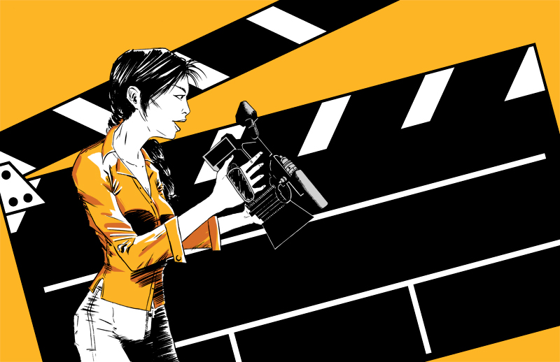
I placed the Photoshop image into an InDesign file. I like to do this in case I want to make changes to the image, which then easily updates in InDesign (as opposed to changing the image then saving as a flat image, then having InDesign update. That may be only one extra step, but it’s an extra step I don’t need). I carefully placed the text in a “safe” area so that it would be completely readable, without obstruction from the middle gutter or risk of getting trimmed off the outside borders during print.
I exported to a CMYK PDF and sent it off to the group. I received some feedback: you may notice a small difference from the original inks, which has slightly thicker eyebrows. The group wanted her eyebrows thinned out in order to “lighten up” her expression. I made this edit in Photoshop, updated the InDesign file, exported again, and DONE. Approved and off to the publisher, INDIEBlush, for March’s issue.